Our most recent Excel project this year began our exploration of circle, or pie graphing. We created a 2-column table to record purchases we thought we might like to make from our very own DDES School Store and the amount of money we might spend, up to $25.00, for those items.
We learned how to create a circle, or pie graph using Excel to display the items we might have chosen and the portion of the $25.00 each of our planned purchases would represent within our circle graph.
We followed a written check-list to create our Excel-lent graphs, amazed at how similar the process was to our experience creating bar graphs with Excel. We learned how to insert patterns and change colors within each section of our circle graphs and are proud to have them displayed on our hallway bulletin board. Our confidence and competence with the technology just continues to grow!
This project aligned with the following Pennsylvania Academic Standards:
1.6.5 Speaking and Listening
1.8.5 Research
2.2.5 Computation and Estimation
2.6.5 Statistics and Data Analysis
3.7.5 Technological Devices
Listen to the Beat of Your Heart!
This page was created April 16, 2005 and last updated: August 9, 2023
We continued to explore using Excel to analyze data, integrating Science and Math with this project, enriching our FOSS Science Living Systems investigation of the circulatory system. We created double-bar graphs to compare our own pulse rates with the pulse rates of a partner.
And, we wondered…
Would the time of day and what we were doing affect our pulse rates?
Pulses were taken and recorded within a table at different times during the course of a day. We used the pulse rate data to create a double-bar graph, amazed by how similar the process was to creating a single bar graph using Excel.
We practiced how to change patterns and foreground colors within the bars of our graphs and reviewed finding averages for our pulse rates and that of our partner’s. And, we continued to explore changing the interval on our graph scales, adjusting the fixed unit, to allow the data to be most easily read.
Our double-bar graphs were completed as a performance task. Very limited oral directions were given as we each followed a written checklist to complete the steps to create our graphs.
Pennsylvania Core and Academic State Standards met with this project:
PA Core Math Standard M05.D-M.2.1.2 Display and interpret data
PA Science Academic Standard 3.3.5 Biological Sciences
PA Science Academic Standard 3.7.5 Technological Devices
PA Science, Grade 5 S.5.A.1 Reasoning and Analysis
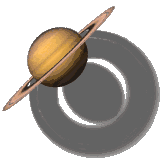
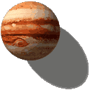
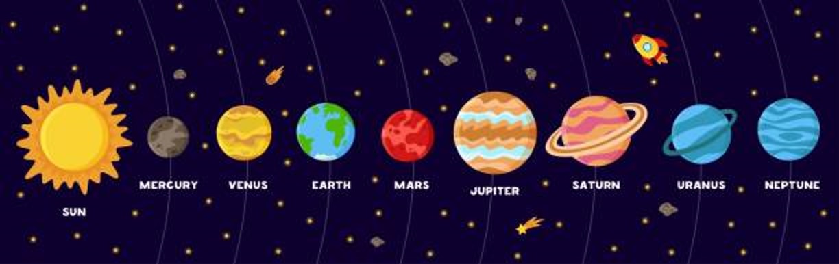
Planet Weights
How Much Do We (or Our Pets) Weigh on Other Planets?
We say that planets have gravity, but actually what we really mean is that there is a gravitational force of attraction between the planet and a person standing on that planet's surface. Therefore, people (or their pets) have different weights on different planets.
We first each multiplied our weight (or the weight of our pet) by hand, using the decimal that would allow us to see what our weight (or our pet's) would be if we lived on another planet. We each checked that multiplication with a calculator and then explored how Excel could display our planet weight data. ...but we weren't quite done!
We searched the Internet for planet images. Working between our Excel chart and the planet images website, we each inserted images of the planets into the bars of our graphs. We each learned how to stack and scale the images to fit the bars without stretching or distortion, and independently created the graphs using a checklist prepared by Mrs. Dingman.
Enjoy these amazing graphs!
Pennsylvania Core and Academic State Standards continued to be met with this project:
PA Core Standard M05.D-M.2.1.2 display and interpret data
PA Core Standard M05.A-T.2.1.3 add, subtract, multiply, and divide decimals to hundredths
PA Academic Science Standard 3.7.5 Technological Devices
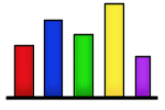
We surveyed our classmates to find out about some of our summer activities. We created bar graphs, using Excel, to show the results of our survey. ... but we weren't quite done...
We searched online to find clipart images to insert into the bars of our graphs, complementing the survey question results we chose to display. We were excellent listeners and carefully followed Mrs. Dingman's oral directions to insert clipart we saved from our Pictures folder. And, we were introduced to another fabulous Excel feature. We learned how to stack and scale the images to fit perfectly into the bars of our graphs, to avoid stretching or distorting them.
We enjoyed using the computers to create our graphs and our new Smartboard made following the steps very easy!
Pennsylvania Common Core and Academic State Standards continued to be met with this project:
PA Common Core M05.D-M.2.1.2 display and interpret data
3.7.5 Technological Devices
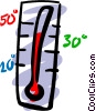
Where in the World is Milford?
There are 21 states in our country that have a town named Milford. We tracked the temperature over a one-week period, using several online weather web sites, and recorded the daily temperature for the Milford we live near and a Milford located in another state.
Using Excel, we created double bar graphs to display our temperature comparison data. We easily and effectively followed the checklist prepared by Mrs. Dingman to insert patterns within the bars.
Our bar graphs were created as a performance task assignment, as we followed our checklists independently and with confidence. We reviewed finding mean, median, and mode, as well as declarative and interrogative sentences, as we wrote statements and questions about the data collected.
Enjoy our Excel-lent graphs!
Pennsylvania Academic Standards continued to be met with this project:
2.3.5 Measurement and Estimation
2.4.5 Mathematical Reasoning and Connections
2.5.5 Mathematical Problem Solving and Communication
2.6.5 Statistics and Data Analysis
2.11.5 Concepts of Calculus
3.7.5 Technological Devices
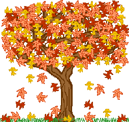
And the Survey Says... Fabulous Fall!
We began our second Excel project of the year and created a list of fall-themed activities or foods, surveying our classmates to find out about their interest in each of our favorites. We created bar graphs, reviewing this process in Excel, to show the results of our survey. Ahhhh ... but we weren't quite done...
We searched online to find graphics images to insert in the bars of our graphs, complementing each of the survey questions asked. We carefully followed Mrs. Dingman's written checklist directions to insert the images we saved from our "My Pictures" folder into each bar of our graphs, reviewing how to stack and scale those images to fit perfectly, without stretching or distortion.
This project was completed as a performance task. Very limited oral directions were given as we each carefully followed a written checklist to complete the steps creating our graphs. Our competence and confidence using the available technology continues to grow!
Pennsylvania Academic Standards continued to be met with this project:
1.6.5 Speaking and Listening
2.6.5 Statistics and Data Analysis
3.7.5 Technological Devices
We began our first Excel project of the year individually choosing 5 countries from a list of those participating in this summer's Olympic games. We visited the Beijing 2008 web site and researched the total number of gold medals earned by the countries we selected. We organized our data within a frequency table and began to create our Excel-lent bar graphs to display it.
Mrs. Dingman introduced us to Excel and we each created a bar graph to show the countries we chose and the gold medals earned. We learned how to adjust the graph's scale to display our data in its most easily read form. Ahhh... but we weren't done!
We visited another online resource to select the flag images for each country we chose. Carefully following Mrs. Dingman's oral directions, we inserted the flag images within each bar of our graphs. And, we were introduced to another fabulous Excel feature when Mrs. Dingman guided us to "stack and scale" each image to fit perfectly within the bars of our graphs.
We enjoyed using our new laptops to complete this project! And, our Promethean board made following the steps to create our graphs very easy!
This project aligned with the following Pennsylvania Academic Standards:
1.6.5 Speaking and Listening
1.8.5 Research
2.6.5 Statistics and Data Analysis
3.7.5 Technological Devices
Our second Excel project this year continued the Summer 2008 Olympic Games theme. We each chose our favorite Olympic sport from a partial list of those featured in this summer's Olympic Games. We conducted a class survey to see who shared our favorite sport opinions and recorded the survey results data in a table.
Choosing 5 favorite sports from those survey results, we reviewed using Excel and created a bar graph to show our data. We reviewed how to adjust the graph's scale to display our data in its most easily read form. Ahhh... but we weren't done!
We visited Microsoft.com to select clipart images to compliment each favorite sport selected in our graphs. We reviewed the process to save each sport image to our "My Pictures" folder. We carefully followed Mrs. Dingman's oral directions, and inserted the sports clipart images within each bar of our graphs, reviewing "stacking and scaling" each image to fit perfectly.
We continued to enjoy using our new laptops to complete this project! And, our Promethean board made following the steps to create our graphs very easy!
This project aligned with the following Pennsylvania Academic Standards:
1.6.5 Speaking and Listening
1.8.5 Research
2.6.5 Statistics and Data Analysis
3.7.5 Technological Devices
... and the Survey Says...
Sensational Summer Olympics Sports
Homework? On Halloween?
Mrs. Dingman!! Seriously??
Our most current Excel project this year continued our exploration of bar graphing. We sorted and counted our Halloween goodies and recorded the data in a frequency table. Using this data, we independently used Excel to create bar graphs to show our "goodies" collected categories and amounts collected.
We learned how to adjust the graph's scale to display our data in its most easily read form. ... but we weren't quite done!
We visited Yahoo or Amazon Shopping to select name-brand images to complement each type of "goodie" represented in our graphs. We reviewed the process to save each image to our "Pictures" folders. We carefully followed Mrs. Dingman's checklist directions and inserted the images within each bar of our graphs, reviewing "stacking and scaling" each image to fit perfectly.
The bar graphs were completed as a performance task. No oral directions were given. We followed a written checklist to create our Excel-lent graphs with growing confidence and competence!
We continued to enjoy using our classroom computers to complete this project! And, our Smartboard continued to make following the steps to create our graphs very easy!
Pennsylvania Core and Academic State Standards continued to be met with this project:
PA Core Standard M05.D-M.2.1.2 display and interpret data
3.7.5 Technological Devices
We began our first Excel project of the year with a survey to find out in which month we each celebrated a birthday. We each created bar graphs, using Excel, to show the results of our survey. ... but we weren't quite done...
We searched online to find a birthday-themed clipart image to insert into the bars of our graphs. We carefully followed Mrs. Dingman's written checklist directions to insert the clipart image we saved from our "Pictures" folder. And, we were introduced to another fabulous Excel feature. We learned how to stack and scale the image to fit perfectly into the bars of the graph, without stretching or distortion.
This project was completed as a performance task. Very limited oral directions were given as we each carefully followed a written checklist to complete the steps creating our graphs. We enjoyed using our classroom computers to create our graphs and our competence and confidence using the available technology continues to grow!
Pennsylvania Core and Academic State Standards continued to be met with this project:
PA Core Standard M05.D-M.2.1.2 display and interpret data
PA Academic Science Standard 3.7.5 Technological Devices
Valentine Candy Hearts Fun (Circle Graphing)
We continued our exploration of Excel-lent graphing with a continued look at circle, or pie graphs, completing a performance task project that was fun and delicious!
We reviewed fractional parts of a whole, sorting and counting the candy hearts by the colors we found in our individual boxes, using a table to record and organize our information. We reviewed rounding fractional parts, making decisions about candy hearts that were not whole and how to include them in our table.
We reviewed how to create a circle graph using Excel to display the portion each candy color represented within our individual boxes. We reviewed how to insert patterns and learned how to change the foreground color within each section of our circle graphs, amazed at how similar this process was to our experience creating bar graphs with Excel. Our confidence and competence with the technology just continues to grow!
... Oh, and when we were done, we enjoyed eating our Valentine candy hearts!
This project aligned with the following Pennsylvania Academic Standards:
2.2.5 Computation and Estimation
2.4.5 Mathematical Reasoning and Connections
2.6.5 Statistics and Data Analysis
3.7.5 Technological Devices
What's the Temperature Like in YOUR Milford?
There are 21 states in our country, including Pennsylvania, that have a town named Milford. We tracked the temperature over a one-week period, using several online weather web sites, and recorded the daily temperature for the Milford we live near and a Milford located in another state.
Using Excel, we created double-line graphs to display our temperature comparison data, showing change over time for 2 different locations. We easily and effectively followed the checklist prepared by Mrs. Dingman to change the line width and markers for our temperature lines.
Our line graphs were created as a performance task assignment, as we followed our checklists independently and with confidence. We reviewed finding averages and discussed our temperature findings as a class, with a brief introduction to the Scientific Method.
Enjoy our Excel-lent graphs!
Pennsylvania Academic Standards continued to be met with this project:
1.8.5 Research
2.3.5 Measurement and Estimation/2.4.5 Mathematical Reasoning and Connections
2.5.5 Mathematical Problem Solving and Communication/2.6.5 Statistics and Data Analysis
2.11.5 Concepts of Calculus
4.6.5 Ecosystems and Their Interactivity
3.7.5 Technological Devices
Create Your Own
Survey & Graphing
We continued our Excel exploration with a project that allowed us to create our own survey questions. We each thought about our favorite "something", created choices to complement the selected category, and surveyed our classmates to find out about their interest in those things. Carefully following our written checklists, we each created bar graphs using Excel to display our survey data. ... but we weren't quite done...
We searched online to find graphic images to insert into the bars of our graphs, complementing each of the survey questions asked. We discussed using a variety of search terms to widen our choices, helping us find that "just right" image. We carefully followed Mrs. Dingman's written checklist directions to insert the graphic images we saved from our "Pictures" folder into each bar of our graphs, reviewing how to stack and scale those images to fit perfectly with no stretching or distortion.
This project was completed as a performance task. Very limited oral directions were given as we each carefully followed a written checklist to complete the steps creating our graphs. We enjoyed using the computers to create our graphs and our competence and confidence using the available technology continues to grow!
This integrated Math/Technology project met with the following Pennsylvania Core and Academic Standards:
PA Core Math M05.D-M.2.1.2 display and interpret data
PA Science Academic Standard 3.7.5 Technological Devices
Our most recent Excel project this year began our exploration of circle, or pie graphing. We created a 2-column sheet with Excel to record purchases we thought we might like to make from our imaginary amazon.com contest winnings and the amount of money we might spend, up to $1,000.00, for those items. ... but, we weren't quite done...
We learned how to use the AutoSum button to show a running total of the items we chose after browsing on amazon.com, allowing our spreadsheets to keep track of the spending of our imaginary contest winnings.
We learned how to create a circle, or pie graph using Excel to display the items we chose and the portion of the $1,000.00 each of our planned purchases would represent within our circle graph.
We followed a written check-list to create our Excel-lent graphs, amazed at how similar the process was to our experience creating bar graphs with Excel. Our confidence and competence with the technology just continues to grow!
Pennsylvania Core and Academic State Standards continued to be met with this project:
PA Core Standard M05.D-M.2.1.2 display and interpret data
PA Core Standard M05.A-T.1 understand the place value system
PA Core Standard M05.A-T.2.1 use whole numbers and decimals to compute accurately
PA Academic Science Standard 3.7.5 Technological Devices
Amazon Shopping Spree
a new look at fractional parts of a whole
We extended the learning of our Valentine Candy Hearts graphing projects, beginning our exploration of the Scientific Method.
We each wondered if the same number of candy hearts would be found in each box, or if the same number of a certain color of candy hearts would be found in each box.
We learned how to write a hypothesis, gather our data, and graph and write about our results. We used a Word template, created by Mrs. Dingman, to simulate a mini tri-fold board to showcase our experiments. Some of the results surprised us and we enjoyed our class discussion about Valentine candy hearts packaging and production.
This project aligned with the following Pennsylvania Academic Standards:
1.6.5 Listening and Speaking
2.2.5 Computation and Estimation/ 2.4.5 Mathematical Reasoning and Connections
2.6.5 Statistics and Data Analysis
3.2.5 Inquiry and Design/ 3.7.5 Technological Devices
Valentine Candy Hearts Investigation (Scientific Method Mini Trifold)
Help your students learn how to create
some Excel-lent graphing of their own!
A variety of project directions
are available HERE in my TPT shop
We integrated a Social Studies topic of study with this project. We read about the Jamestown settlement of 1607-1608 and connected it to our exploration of Excel-lent circle graphs, looking at fractional parts of a whole in a new way.
We visited Virtual Jamestown online to research occupations held in the colony, recording the data we found. We each followed a written checklist independently to create a circle graph, using Excel, displaying our research data.
We learned how to insert patterns and change the foreground color within each section of our circle graphs. We made good use of the teaching materials available from the Virtual Jamestown online resource. And, we enjoyed discussing and writing about why we thought the number of people performing each job out of the total number of people in the colony may have contributed to the problems the Jamestown settlement had.
This project met with PA Core and Academic State Standards:
PA Core Math M05.D-M.2.1.2 display and interpret data
PA Academic History Standard 8.1.5 Historical Analysis and Skill Development
PA Academic History Standard 8.3.5 U.S. History
PA Academic Science & Technology Standard 3.7.5 Technological Devices
What's the Temperature Like in YOUR Town?
an integrated Math and Science project
Our most recent Excel project explored comparing the daily temperature over a 5-day period for 2 different geographical locations sharing the same name.
We completed some family tree research at home to discover the names of cities or towns in which we, our parents, and our grandparents were born.
We each selected one family member birthplace location and a city or town sharing that location name.
We each tracked the temperature online for both locations over 5 days, and graphed the results of our data using Excel. We each learned how to create double-bar graphs to compare the data, independently following a written checklist. We each easily and effectively changed the patterns and foreground colors in our bars to distinguish one town location from another.
Review of finding the mean or average temperature, and discussion about data result surprises were also included in this project.
This project aligned with the following Pennsylvania Core and Academic Standards:
PA Core Math Standard M05.D-M.2.1.2 Display and interpret data
PA Science Academic Standard 3.7.5 Technological Devices
PA Science Academic Standard 4.6.5 Ecosystems & Their Interactivity
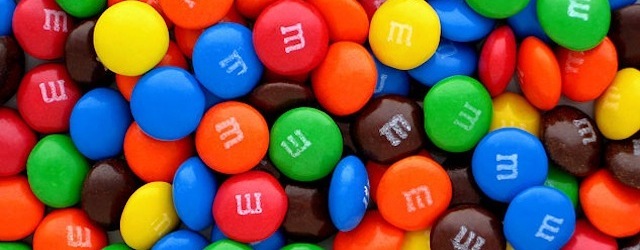
M & M Graphing
What Was in YOUR Bag?
This project meets with the following Pennsylvania Core and Academic Standards:
PA Core Math Standard M05.D-M.2.1.2 Display and interpret data
PA Science Academic Standard 3.7.5 Technological Devices
We began our most recent Excel project sorting and counting the candy colors found inside small packages of M & M's. We used our candy color information to create bar graphs using Excel, continuing to use the available technology to compare data. But, we weren't quite done.
We searched online to select clipart or name-brand images to complement each M & M candy color represented in our graphs. We reviewed the process to save each image to our "My Pictures" folders.
We carefully followed our project directions checklist to insert the M & M candy color images we saved from our "My Pictures" folder into each bar of our graphs, practicing how to stack and scale those images to fit perfectly, without stretching or distorting.
Our competence and confidence using the available technology continues to grow!
Want your students to create their own Classroom Birthdays Excel graphs?
Find it HERE, with Google Slides digital student directions, and a self-grading Google Form rubric
Want your students to create their own M & M Excel graphs?
Find it HERE, with Google Slides digital student directions, and a self-grading Google Form rubric.
Want to encourage your students to create their own Summer Fun Excel graphs?
Find it HERE, with Google Slides digital student directions and a self-grading Google Form rubric, in my TPT shop
Want to encourage your students to create their own Planet Weights Excel graphs?
Find project directions HERE, with Google Slides digital student directions and a self-grading Google Form rubric, in my TPT shop!
Excel Graphing
Temperature Comparison Project
available in my TPT shop HERE